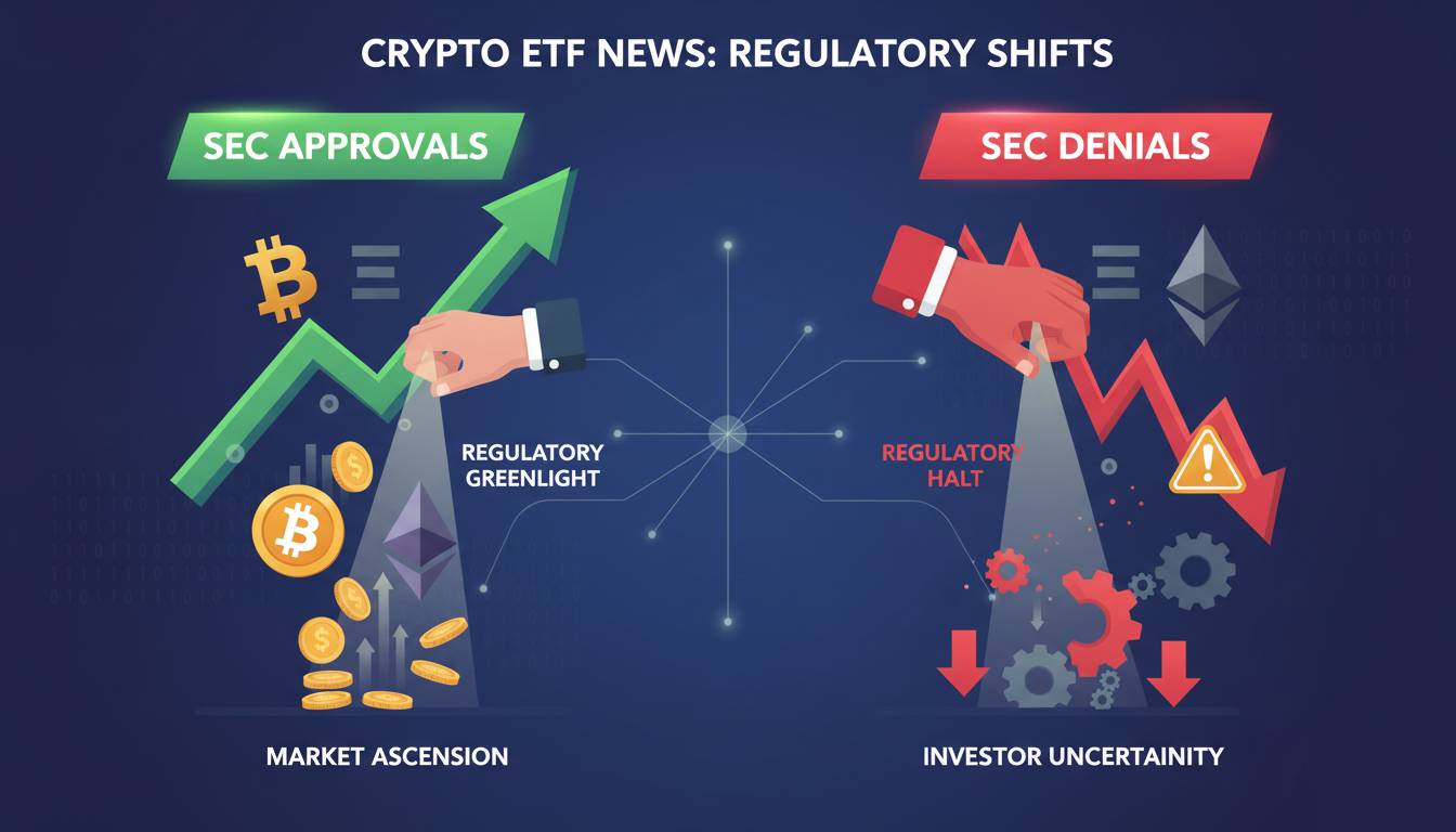

The distinction between a Bitcoin crash and a correction isn’t just academic semantics—it directly impacts how you manage risk, position sizing, and exit strategy. I’ve watched traders blow up accounts because they mistook a crash for a correction and held onto positions waiting for a recovery that never came. Others panic-sold during normal corrections and missed substantial rebounds. The difference often comes down to understanding five specific signals that experienced traders watch for. None of them involve a single percentage number, and that’s exactly where most retail traders get it wrong.
1. The 20% Rule Is a Dangerous Oversimplification
You’ll find 20% cited everywhere as the threshold between correction and crash. This is misleading at best and actively harmful at worst.
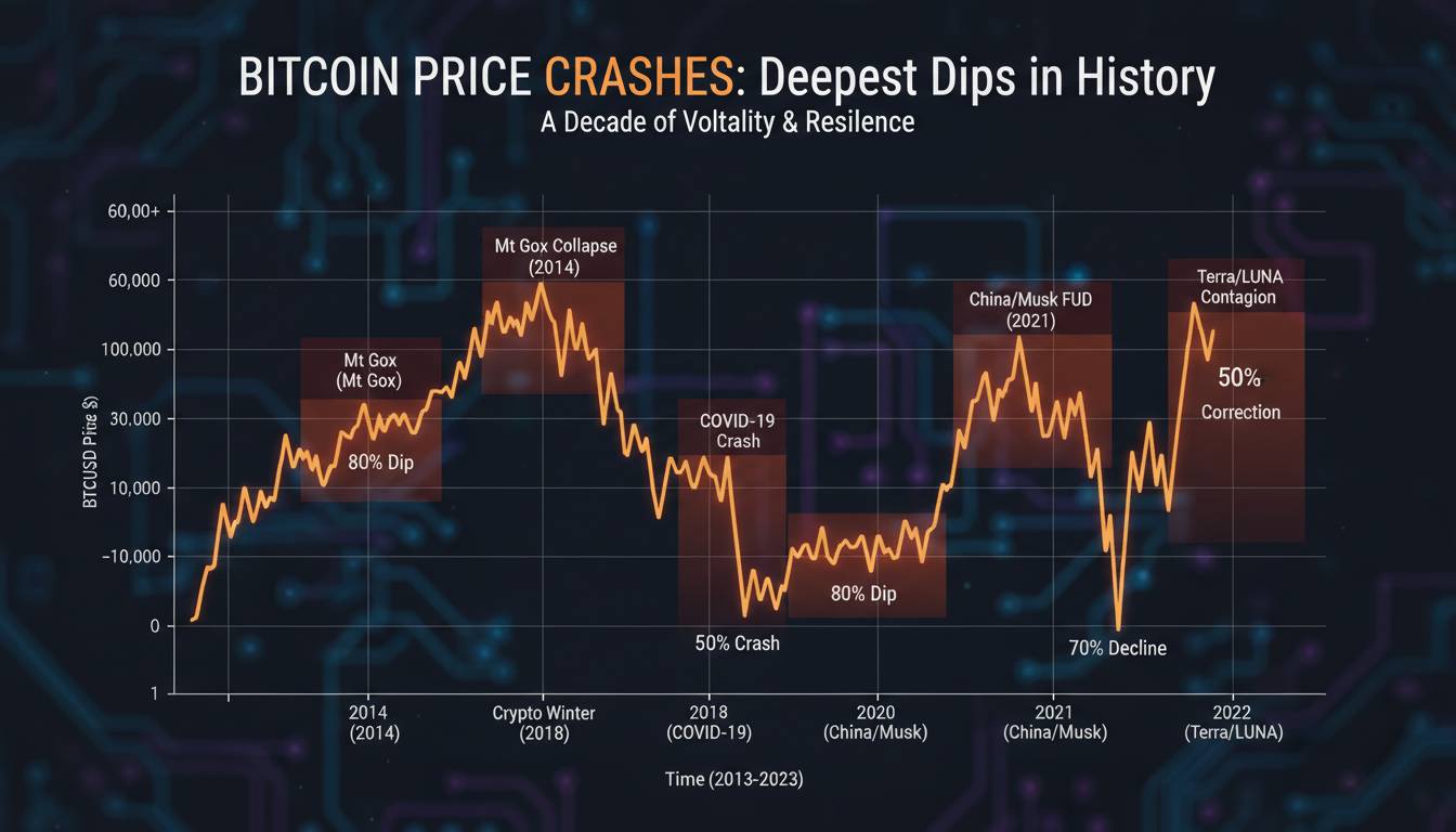
A 20% drop from Bitcoin’s all-time high isn’t automatically a crash. In December 2023, Bitcoin dropped approximately 22% from its $44,000 range—that was a correction that reversed within weeks. Meanwhile, the 2022 collapse saw multiple 20%+ drawdowns that were clearly crashes within a larger bear market structure.
What matters is context: Where is Bitcoin trading relative to its major support zones? What is the momentum structure telling you? A 20% decline in a parabolic uptrend often signifies correction. The same percentage decline in a bear market cycle is often just another leg down in a crash.
The practical takeaway: Ignore the 20% number as a decision rule. Instead, ask yourself whether the price is breaking below significant horizontal support levels or trendlines that have held for months. If support breaks with volume, you’re looking at crash behavior. If it holds, you’re likely in correction territory.
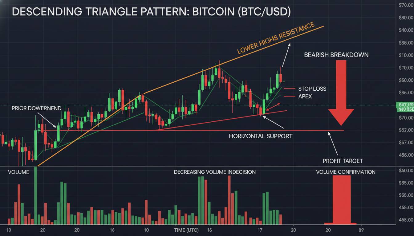
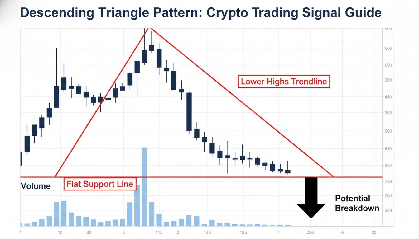
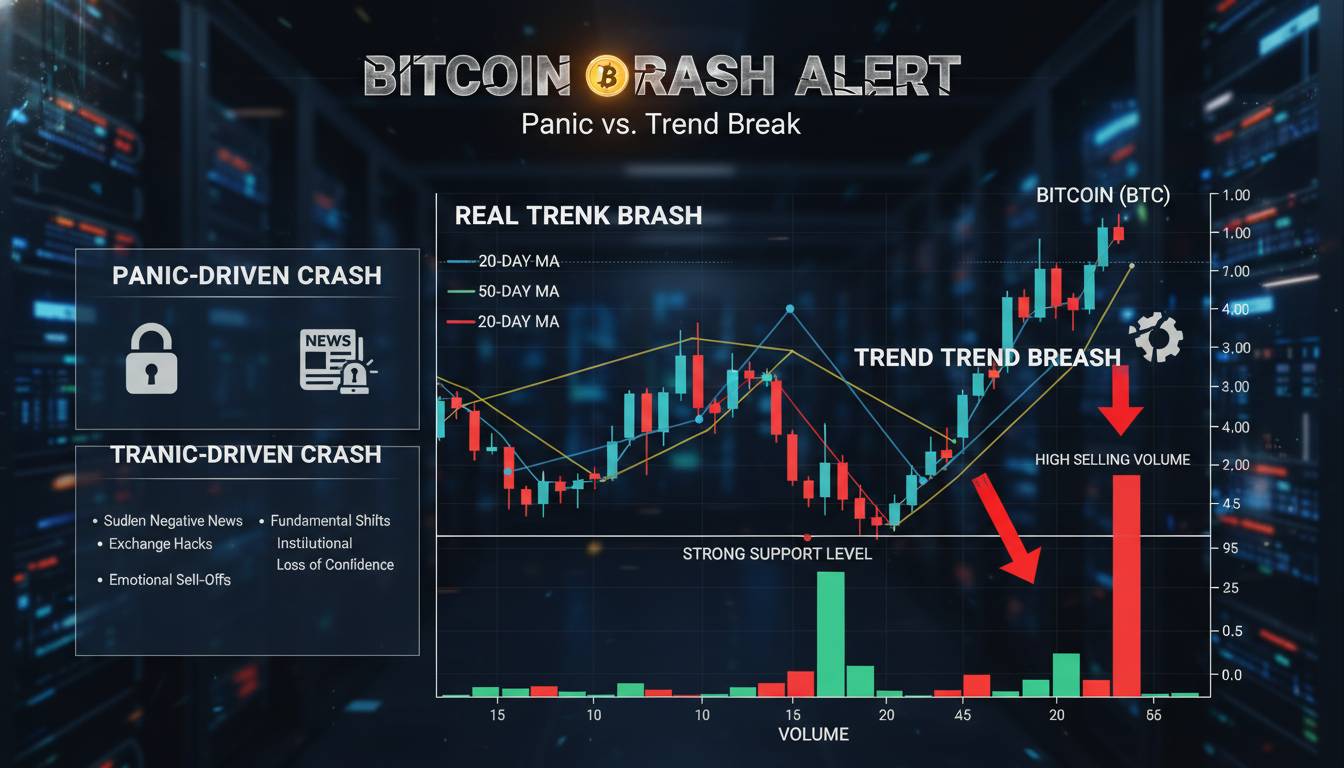
2. Volume Profile Separates Panic from Pullback
Volume is the most reliable indicator I know for distinguishing crashes from corrections, and it’s frustratingly underused by retail traders.
During a correction, selling volume typically decreases as price declines. This shows exhaustion—sellers are running out of conviction. The price drops on declining volume, creating a technical divergence that often precedes reversal. You’ll see this pattern clearly on any chart: price makes lower lows but OBV (On-Balance Volume) or cumulative volume delta begins flattening.
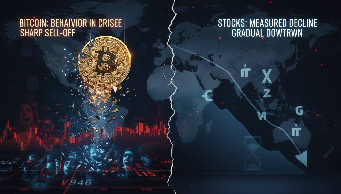
Crash behavior is the opposite. Volume spikes during the decline and often stays elevated during any bounces. Every attempt at recovery gets met with fresh selling pressure. This indicates distribution—smart money is actively exiting while retail is still buying the dip.
Look at the March 2020 crash: volume spiked to 3x the daily average as Bitcoin fell from $9,000 to $3,800 in 48 hours. The subsequent bounces showed衰竭 (exhaustion) with dramatically lower volume. Contrast this with the July 2021 correction from $64,000 to $29,000—volume remained relatively contained, and major bounces showed strong volume expansion, signaling healthy pullback rather than collapse.
Pull up a volume histogram on any timeframe above 4 hours. If declining price coincides with declining volume, treat it as correction until proven otherwise. If price decline accelerates with volume expansion, protect your capital.
3. Time Structure Reveals True Market Character
How long a decline lasts tells you something critical that price alone cannot.
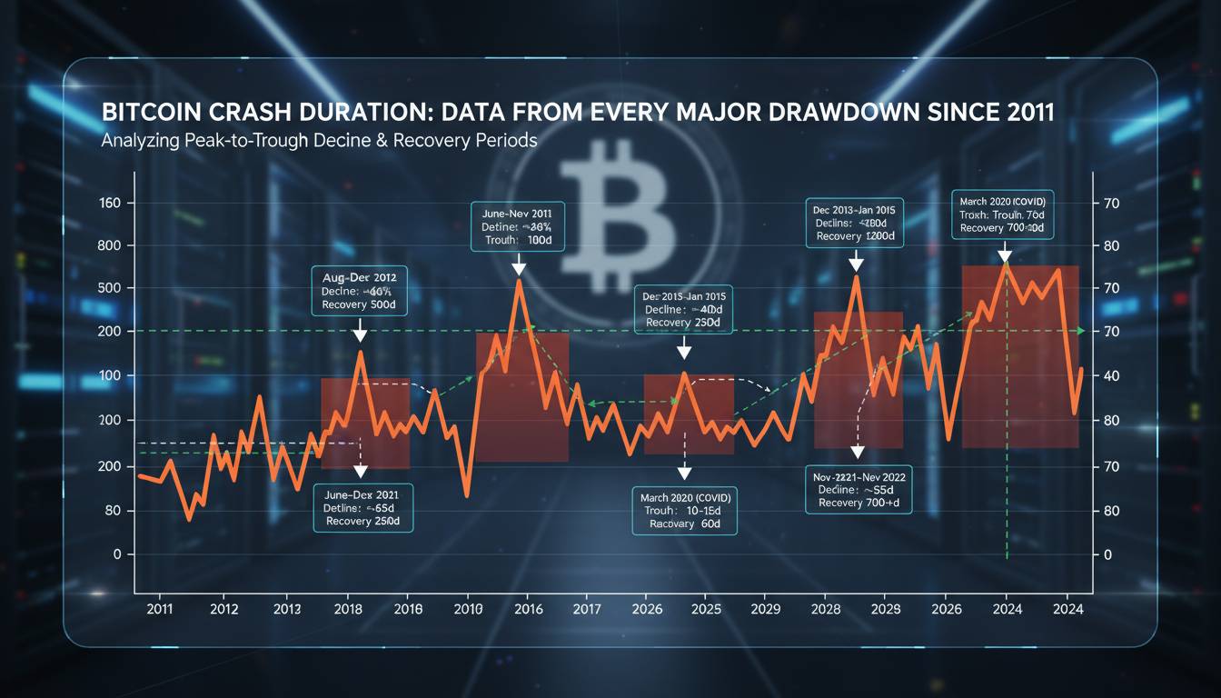
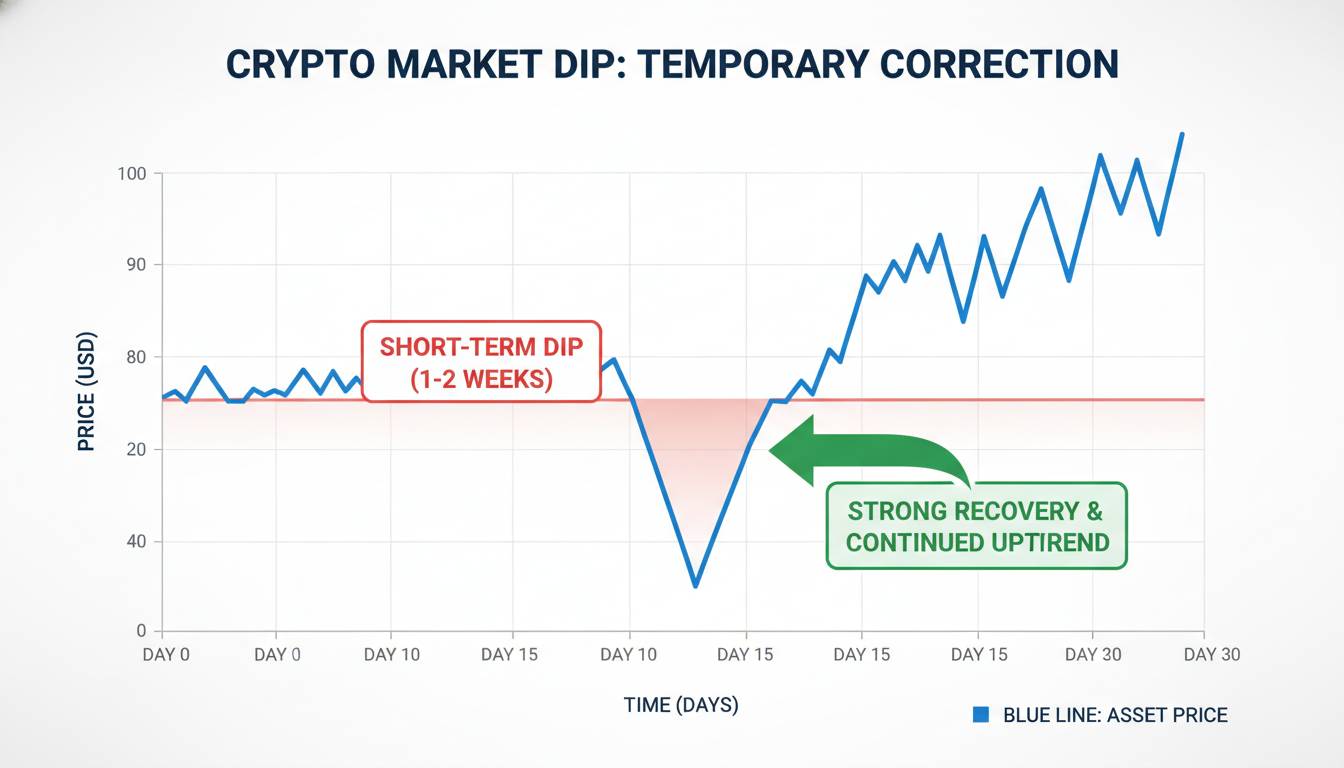
Corrections tend to be time-compressed. They represent temporary dislocations that get corrected relatively quickly—typically within weeks to a few months. The 2023 correction from $31,000 to $24,000 unfolded over approximately six weeks before recovery began. The August 2021 flash correction took 48 hours. These timeframes suggest market structure remains intact.
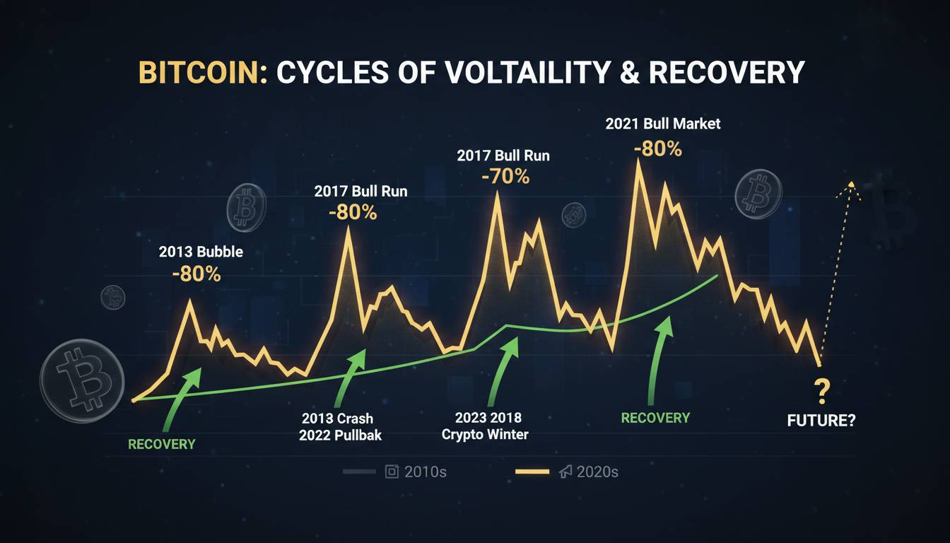
Crashes unfold over months or even years. The 2022 bear market lasted approximately 12 months from top to bottom, with the final collapse phase spanning November 2022 to November 2023 (the FTX aftermath and subsequent accumulation). This extended timeframe reflects fundamental breakdown—either in market mechanics, sentiment, or both.
The key insight: corrections are V-shaped. Crashes are U-shaped or worse. If you’re six weeks into a drawdown and still seeing lower lows, the correction narrative becomes increasingly questionable. Time itself becomes evidence.
One caveat that many articles ignore: crashes often have sharp bear market rallies that fool traders into thinking correction has turned to recovery. The 50% rally from November 2022 ($15,600) to February 2023 ($25,000) looked like correction reversal but was actually bear market rally within continued downtrend. Time structure helped identify this—the overall downtrend remained intact despite the interim strength.
4. Historical Pattern Recognition Beyond the Headlines
Every crash and correction follows identifiable structural patterns, and experienced traders learn to recognize these.
Crashes typically follow one of three patterns: capitulation cascades (panic selling with no support), breakdown from accumulation (the opposite of what it sounds like—distribution that traps buyers), or failed recovery attempts (price recovers to broken support which now acts as resistance). The November 2022 FTX collapse was capitulation cascade. The 2018 bear market featured multiple failed recovery attempts.
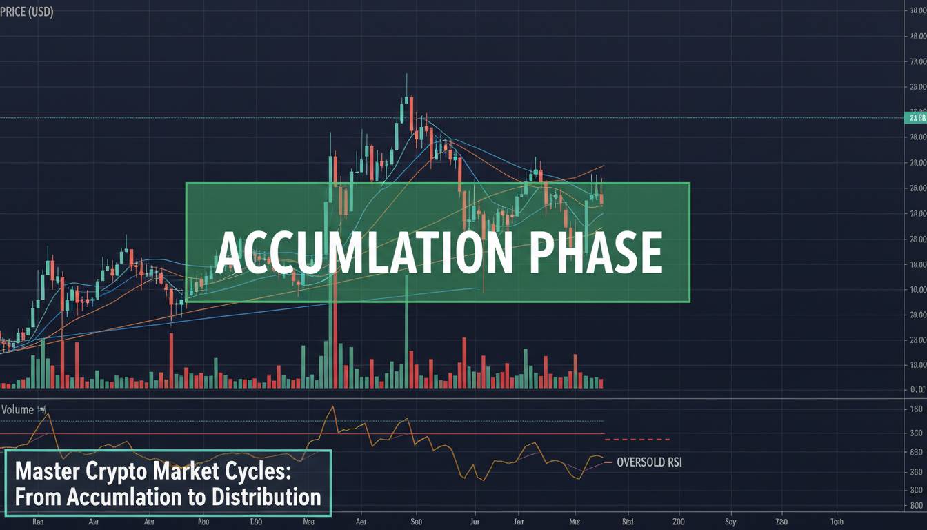
Corrections typically follow pullback patterns: trendline corrections (price retraces to major trendline support), horizontal support corrections (price finds support at previous breakout levels), or moving average corrections (price retraces to 50/100/200 MA zones).
The mistake most traders make: they look for pattern confirmation after the fact and convince themselves the pattern was obvious. The real skill is identifying the pattern in real-time as it develops.
Here’s what to actually do: When Bitcoin declines, sketch out the price structure on paper (or a TradingView annotation). Mark the highs and lows. Ask yourself: is this making lower highs and lower lows (crash structure) or is it maintaining higher lows within an uptrend (correction structure)? The answer becomes obvious when you visualize it rather than just watching price tick by.
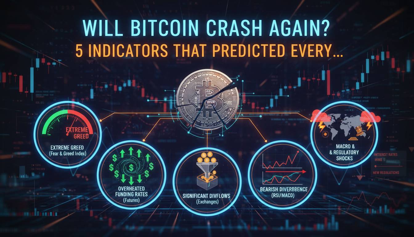
5. On-Chain and Sentiment Data Provide Confirmation
Price and volume are necessary but not sufficient. The most complete analysis includes on-chain metrics and sentiment indicators.
Exchange reserve data shows whether coins are moving on or off platforms. During corrections, exchange reserves typically decrease as holders move coins to cold storage—a sign of conviction. During crashes, exchange reserves often increase as holders panic and send coins to exchanges to sell. This distinction is visible in the data.
The Puell Multiple, which compares current mining revenue to historical average, often signals corrections when it enters oversold territory—miners are financially stressed, but not catastrophically so. During crashes, you’ll see this metric stay depressed for extended periods.
Sentiment indicators like the Crypto Fear & Greed Index provide useful contrarian signals. Extreme fear (below 25) has historically marked correction bottoms. Extended periods of neutral-to-fear sentiment spanning months often accompany crash phases.
Don’t rely on any single indicator. Look for confluence. When price breaks a major support level, check exchange reserves. When you see declining volume, check sentiment. When you see a time structure suggesting crash, check on-chain metrics. Three confirming signals means you’re probably right about the market character. One signal means uncertainty.
Why This Matters More Than You Think
The distinction between crash and correction determines your entire strategy. Treating a crash as a correction means holding through a 70%+ decline and watching your portfolio lose most of its value. Treating a correction as a crash means selling at precisely the wrong time and locking in losses before recovery.
Most educational content gives you rules: “20% is correction, 50% is crash.” These rules fail because market structure is dynamic. What matters is the methodology—observing multiple signals, understanding context, and adjusting your framework as conditions change.
The uncomfortable truth is that sometimes you won’t know which you’re in until weeks or months later. That’s not a failure of analysis; it’s the nature of markets. What you can do is size your positions appropriately, set stops based on technical levels rather than emotional pain, and remain honest with yourself about what the evidence actually shows.
The traders who survive long-term aren’t the ones who predict perfectly. They’re the ones who manage risk when they’re uncertain. That skill matters far more than calling the top or bottom of any given move.